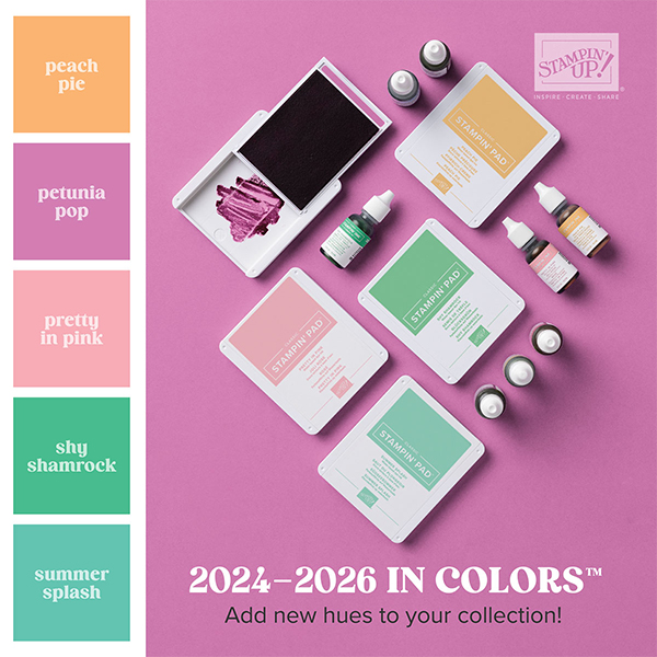
The new Annual Catalog is now live! I’m loving the debuting 2024-2026 In Color line and am looking forward to creating with fresh color combinations. Thought I’d introduce the bunch and include some comparisons to both retired and current colors. Let the comparisons begin!
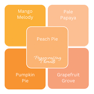
First up is the tempting Peach Pie. It’s a lovely darker peach color, not as yellow as my sorely missed Mango Melody. Nice to have another orange-y color to work with.
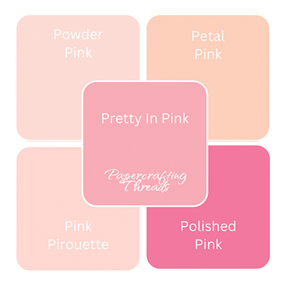
I admit, when Pretty in Pink was around the first time, it was one of my least used colors. But as part of the new In Colors, it definitely holds its own. I think of it as a ‘true’ pink.
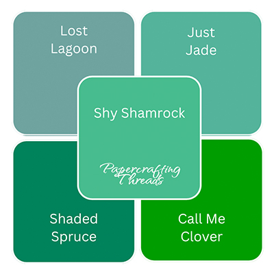
Is there such a thing as a velvety green? That’s what Shy Shamrock reminds me of. The name is very apt, a vibrant green that’s not in your face.
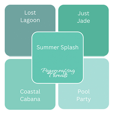
Yippee a new turquoise! No surprise that I love this color. This one’s a luscious deep shade. Think a more saturated Coastal Cabana.
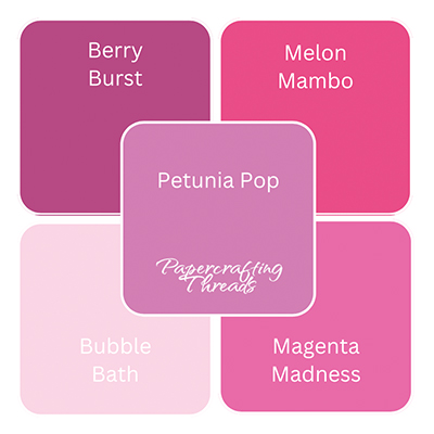
Oh my stars, look at Petunia Pop with Berry Burst and Bubble Bath! I’m in love. I might have to say this one is my favorite.
No matter which hue (or more than one) is your favorite, let me know what you think in the comments. I think Stampin’ Up! hit it out of the park with this batch of 2024-2026 In Color shades.
Leave a Reply