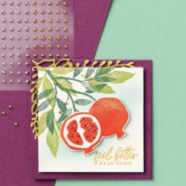
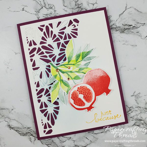
Need a guide to card design? Help is as close as the Stampin’ Up! catalog. The card I’m sharing today was inspired by this card in the current Sale-a-Bration catalog. I used the coloring as my starting point and changed out a few things. Using the catalog this way is perfect if you’re a beginner or if you’re a seasoned card maker who needs a boost.
Scoring & Cutting guide
| Paper Dimensions | Score Short Side | Score Long Side | ||
| 4-1/4″ x 8-1/2″ Rich Razzleberry cardstock base | 4-1/4″ | |||
| 4” x 5-1/4” Basic White cardstock (x2) | ||||
| Scraps of Basic White cardstock |
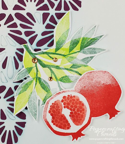
The square card pictured above from the summer Sale-a-Bration catalog was my inspiration. I changed the base from square to the standard portrait rectangle. Then I added a Basic White mat and diecut the top left corner with the Split Card Texture die. While I punched out most of the diets, I did leave a few for interest. The original card had a Balmy Blue background, so I used a blending brush and a circular motion to rub Balmy Blue ink over the center of my card mat.
I loved the Mango Melody greeting on the catalog sample so I stamped my greeting in the same ink. I also used the same ink as the sample for my pomegranates, Poppy Parade. Brighter ink colors for the leaves — Shaded Spruce and Parakeet Party — give added vibrancy. I also fussy cut the leaves and popped up the top with Dimensionals while adhering the bottom of the leaves directly to the card front. Champagne Rhinestones sparkle on a few stems. And Wink of Stella over just the inside seeds of the pomegranate hint at the juiciness. Check out the short video over on my YouTube channel to see this card being made. And there’s still time to place a qualifying order to get FREE stamps, dies or paper.


Leave a Reply